07 February 2009
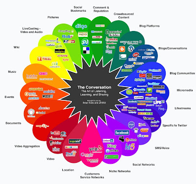
The Conversation Prism

I began seeing concepts like this a while back. I think one had to do with Web 2.0 and one tried to project what Web 3.0 would look like. But the Conversation Prism (built off work done by Robert Scoble and Darren Barefoot) seems to be a bit more helpful.
Obviously, in today's fast moving tech culture, it is very difficult to create something that is all-inclusive. And even harder to create something that will make sense for longer than six months...
But for the here and now - this does make sense. It is a snapshot of the way the Internet is being used right here-right now. It seeks to display graphically, what O'Reilly takes 5 pages to define. And while the Conversation Prism isn't meant to be an expose on Web 2.0, it can't escape the fact that the majority of the apps listed are Web 2.0 in that they foster communication, interactivity and the ability for the user to communicate and add value to the Internet.
Take some time to look through the categories and the listed online apps. If you are like me you'll find a bunch you've never heard of before, check them out and possibly add them to your toolbox.
